What is going on in web typography now? Which web designing typography design trends 2019 must you look out for?
Earlier in 2018, there have been some typography design trends. But, now many new styles have started to emerge. In fact, many web designers are exploring new ways to design their websites in a better way. Moreover, typography is a popular trend in web design now.
From size and formatting trends to custom fonts, there is a myriad of typography trends in web design. But, why are so many designers preferring unique and novel typography for their website designs? Well, a good choice of typography helps in improving the look and feel of the websites. So, what are the typography trends in web design to look out for in 2019? Let us take a detailed look.
- Missing and scattering of letters
Crop and cut text: Web designers are cropping or cutting up letters in a word. But, designers must do this in such a way that there is enough space to ensure that the letters are legible. Besides, the sole aim of designers is to create an interesting and unique typographic design. This is somewhat like the concept of the game called ‘Hangman’. Further, the neural behavior of humans allows them to read and understand words even if some characters are missing.
Thoughtful scattering of letters: One of the latest typography trends in web design is the use of scattered text. However, one must be careful while deploying it. This is because it can be risky and reduce both the readability and accessibility of the text.
For instance, The Impossible Is Inevitable, is an exhibition at Moscow’s Jewish Museum and Tolerance Center that uses scattered text typography. Besides, the names are in a floating style with strung-together letters on the homepage.
The scattered orientation of letters on the homepage contributes to a larger meaning. Also, the small threads join the visually disparate letters together. They represent the exhibit’s exploration of the unknown.
- Graphical and negative imagery
Adding negative imagery: Integrating artwork into your typography is another way to make the text on your webpage stand out. One can enable popping out of graphical elements from a negative space within the type itself. This will also create a look of different dimensional space.
One popular example is YouTube. It displayed an animation inside the characters of the title of each story in its ‘Greatest Stories Retold’ project. Also, the homepage included many different animations within the headline. The headline animation often gave a clue about upcoming things.
Besides, the ‘Greatest Stories Retold’ includes short tale videos of 6 seconds only. They also help in advertising. For instance, BBH London used the Ugly Duckling from the popular story and turned it into ‘The Swan’ to convey their message.
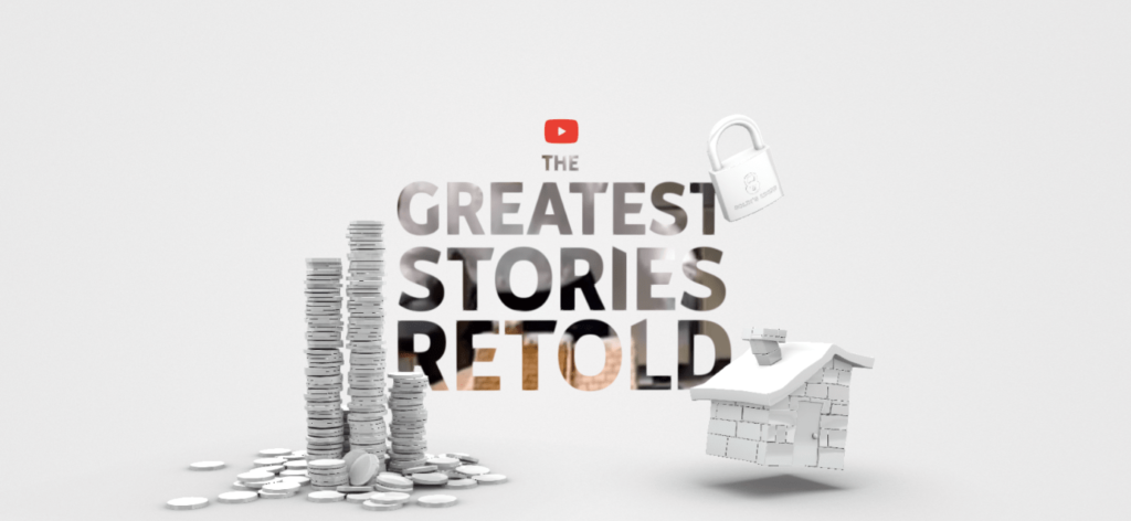
Source: https://www.thinkwithgoogle.com/
Graphical typography: Instead of the old flat typography, including graphics will always make your webpage look better. It gives textual elements more impact on the page. Thus, creativity can work like magic here. From furry to paint-like texts, it adds a different angle to the page. Moreover, the aim is to make the typography look more like an object instead of a character.
- Monospaced typefaces
The increased popularity of monospaced fonts has become one of the latest typography trends in web design. Monospaced typefaces have emerged in text-intensive settings with small point sizes. But, they are also used as larger elements of a website’s design. One such example is the Laurent Desserrey which is a design of an attractive portfolio. It creates a wonderful effect with the combination of blinking background images and monospaced type.
- Serifs are back
Bold Serif fonts are the new option for web designers today. Serifs have continued rising to the topmost place in the font kingdom. From elegant titles to sophisticated headlines, they create an impact on the readers.
Besides, lettering doesn’t always need to be ornate to create a solid impression on the viewers. The Sans serif typefaces have thicker stroke widths that make them one of the most common font alternatives for new websites.
What is so special about the Serifs? Well, these typefaces are easy to read. Also, they help in creating a contrast between the background and text elements easily. Thus, this makes the Serifs one of the most effective typography trends.
Let us take a look at some websites that have mastered the art of using Serif for their websites. For instance, web designers behind Cobble Hill and Gin Lane are targeting minimalist sites with a serif-induced elegance.
- Attention-seeking bold fonts
Websites like the CreativeDoc and Souffl, have set the bold typography trend by using bold fonts and grabbing the attention of the readers. The creation of loud designs with only six bold white letters on a black background makes CreativeDoc’s design unique.
Indeed the big, bold, and condensed text looks dramatic on any webpage. That is why designers often use bold text as a primary element for web designing. Besides, more and more designers have started replacing images with bold headlines ie. brand names or important messages.
- Highlighting of text
The main function of typography also includes the ability to establish a hierarchy of content. The advantage of highlighting is that it helps readers to skim and scan and get a gist of the website. Let’s see how web designers use highlights to create the content hierarchy. Let us also see how they add a pop of color to it.
- Godfrey Dadich is a design agency in San Francisco. It uses a neon green highlighter for the primary offerings.
- Cornell University is also following the trend of text highlighting. The website ‘Engaged Cornell’ uses neon-yellow highlights. Thus, readers can engage with the core text in an effective manner.
- Horizontal and vertical text
If you want to break up blocks of text, then adopt a mixture of horizontal and vertical texts. Moreover, it is a stylistic approach to typography. It also improves the look by getting rid of the traditional horizontal alignment.
For example, ‘Take What You Can Carry’ is a website for a film that doesn’t use horizontal text alignment. The site has replaced it with a single word.
Another example is the ‘Elegant Seagulls’ that uses vertical text alignment. It also uses a continuous scrolling effect. But, the navigational elements remain horizontal only otherwise it may disrupt the whole look.
Signing off…
Over the years, everything from screens and fonts to design technologies has advanced. Similarly, typography trends in web design have experienced a major transformation at a rapid growth rate. There are many nuanced trends in design and typography has a lot of benefits. On the one hand, it helps to represent the brand of your company. Yet, it also helps in providing a very good visual appeal to your website. However, the typography trends must maintain the readability, accessibility, and functionality. So, what types of trends do you know? Are there any other typography design trends that may make websites look the best? Do drop in your words to learn more about website designing and trends.
P.S. We are proud to announce that we are recognized as a Top Website Design Agency on Design Rush
Shipra Garg is a tech-focused content strategist and copywriter specializing in Web3, blockchain, and artificial intelligence. She has worked with startups and enterprise teams to craft high-conversion content that bridges deep tech with business impact. Her work translates complex innovations into clear, credible, and engaging narratives that drive growth and build trust in emerging tech markets.