

Most sites don’t lose people because they look bad. They lose people because using them feels like work. User experience covers all of that felt effort: whether someone finds what they came for, whether a person on a screen reader can get through the form, whether tapping a button does the thing you expected it to do. Companies spend real money pulling visitors in and then hand them an interface that quietly asks too much. Which is why arguments about UX in web design stop being taste arguments the second you look at what happens after the click. What follows is the working parts, and the spots where teams usually get stuck.
Key Components of a Successful UX Strategy
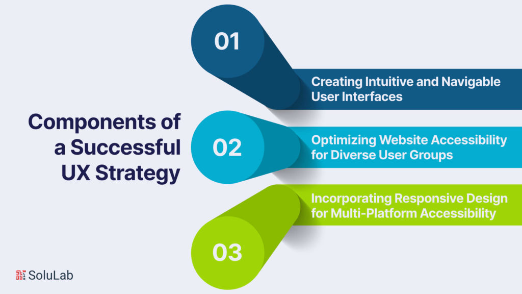
Interfaces People Can Read Without Thinking
Start with the surface people actually touch. Layout, labels, where the next step sits. If a visitor has to stop and build a mental model of your site before they can act, you have already spent some of their patience. Good navigation is boring navigation: predictable categories, plain names, nothing clever. In practice this is where teams overcorrect, inventing a menu taxonomy that makes perfect sense inside the company and nowhere else.
Accessibility, For The Whole Audience
Accessibility is not a bolt-on. It sits inside UX, and teams doing UX design and development work treat it that way: the site has to be usable by people with a range of abilities, not merely tolerant of them. Contrast, keyboard paths, alt text, focus order, error messages that say something. Build it into the first wireframe and it costs you almost nothing. Bolt it on a year later and you are usually rebuilding.
Responsive Design, Because Nobody Owns One Screen
The same person reads you on a phone at a bus stop and on a laptop two hours later. Responsive design is a baseline part of any UX strategy for exactly that reason: desktop, tablet and phone all have to hold up, and the experience has to feel like one product across them. Not identical. Consistent. There is a difference, and it usually lives in how you handle the navigation on small screens.
Impact of UX on Website Performance and Engagement
Navigation And How Long People Stay
Navigation does most of the heavy lifting on engagement, and an experienced Austin web design company knows how much structural work that takes before anything looks designed. When people can move around without pausing to figure out where they are, they stay longer, open more pages, and actually read the content instead of skimming for the exit. The reverse holds just as firmly. A confusing menu is a bounce with a delay on it.
Looks Matter, But Not The Way People Think
Function comes first. That said, visual design carries real weight in how people interact with a page: colour, type, imagery, the space between things. It sets an emotional read before anyone has processed a single sentence, and a good one makes visitors willing to keep going. A design that feels considered buys you patience. One that feels careless spends it.
You Can Actually Measure This
Here is the part that gets budgets approved: the effect of UX on conversion is measurable. A well built experience carries people through the funnel without friction, whether the goal is a purchase, a completed form, or a newsletter signup. Fewer dead ends, fewer surprises, more finished actions. Track drop-off step by step and the design problems announce themselves without anyone needing to hold a workshop about it.

Implementing UX Best Practices in Web Design
Research Before Opinions
Research is the floor the rest of it stands on. UX people dig into who the audience is, what they want, and where they currently give up, before anyone opens a design tool. That grounding keeps design choices tied to what users expect and to a broader website design strategy, which is how you end up with a site that works rather than one that won an internal argument.
Feedback, Then Do It Again
A site is never finished. Feedback arrives, the design shifts, more feedback arrives. That loop is the actual work in UX design and development, and skipping it means you shipped your first guess and now you live with it. Small refinements, repeated over months, beat one heroic redesign. They also keep the site responsive to what users need now rather than what they needed when the brief was written.
Cutting Steps Out Of The Path
A user journey is just the route somebody takes to get a thing done. Map it, then start deleting. Every extra screen, confirmation dialog and optional field is another place to quit. Designers who lay out the real flows, not the tidy ones from the slide deck, usually find steps that exist for no reason beyond nobody having removed them. Shorter path, better experience. It really is that blunt.
The Role of Information Architecture in Optimizing UX
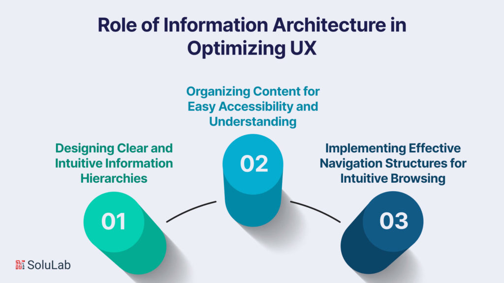
Hierarchy People Can Predict
Information architecture is the unglamorous business of deciding what goes where. Get the hierarchy right and people find things without noticing they were guided anywhere. Get it wrong and no amount of visual polish rescues the page. Clear categories, sensible grouping, one obvious home for each thing rather than three plausible ones.
Content That Can Be Scanned
Nobody reads a page top to bottom. They scan, hunting for the bit that concerns them. So labels should say what they mean, content should be grouped by how visitors think rather than by how your org chart is drawn, and headings and subheadings should carry the structure on their own. Readable and accessible are the same target here, not two competing ones.
Menus, Links, And The Obvious Next Step
Navigation is the backbone of a usable site. Menus that make sense, links that say where they go, calls to action placed where the decision actually happens instead of where there was space in the layout. Get those three right and moving between pages stops feeling like a task. Frustration falls. So does the number of people who leave because they could not find the pricing.
The Integration of UX and SEO for Enhanced Website Performance
Where UX And SEO Stop Being Separate Jobs
Treating SEO and UX as two departments is a mistake that eventually shows up in the rankings. Elements like page load speed, mobile responsiveness and a design people can use feed straight into search visibility. Search engines favour sites that treat visitors well. That is not a loophole to exploit, it is the whole design of the system.
Speed Is A Design Decision
Load time is UX, not just infrastructure. People expect a page to appear, and when it stalls they leave, and they blame you rather than their connection. Cutting weight and shortening the time to something useful on screen lifts satisfaction and helps rankings at the same time. It is one of the rare improvements where the visitor and the search engine want exactly the same thing.
UX Work That Shows Up In Rankings
Search engines weigh signals that come out of experience rather than keywords: how engaged visitors look, how long they stay, whether they bounce straight back to the results page. Those are UX outcomes. Improve the experience and the metrics move on their own. It is a slower route to better rankings than most tactics, and a considerably more durable one.
The Significance of UX in eCommerce and Online Transactions
Checkout Is Where The Money Leaks
Checkout is where eCommerce UX earns its keep or loses it outright. Every extra field, every forced account creation, every shipping cost that appears at step four is a reason to abandon the cart. So simplify. Fewer steps, visible progress, payment methods people recognise, and a path that feels secure the whole way through. Friction at checkout is expensive in a way that is easy to measure and easy to ignore.
Trust Is Built In The Details
People hand over card details to sites that feel competent. That feeling gets assembled from small things: a clear return policy, visible security cues, no layout jumping around mid-form, no dark patterns nudging anyone into a subscription they did not ask for. Design that respects the shopper gets repeat shoppers. It is also the cheapest brand work anyone will ever do for you.
The Journey Before And After The Sale
The customer journey covers every interaction someone has with a brand, not just the ones on a product page. Find the touchpoints. Find where people hesitate. Then fix those specific moments instead of redesigning the entire site because one number looked bad. Conversion rates rise because you removed reasons to stop, not because you added a banner telling people to hurry.
UX Trends and Innovations Shaping Modern Web Design
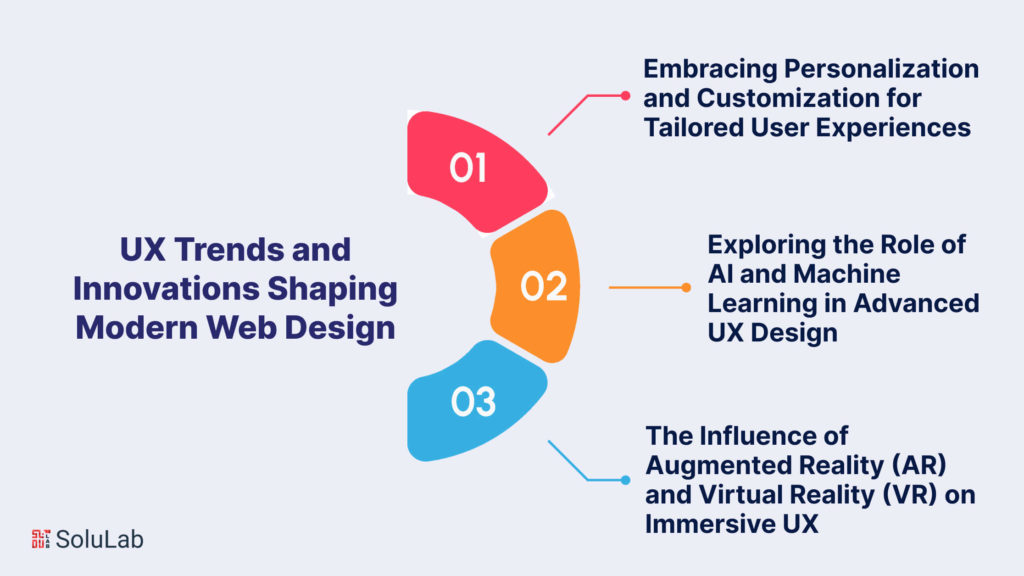
Personalisation People Actually Want
Personalisation has gone from novelty to expectation. Recommendations, content that shifts based on what someone already did, interfaces that remember a preference instead of asking again. Done well it feels like being recognised. Done badly it feels like being watched, and the line between those two is thinner than most product teams assume when they turn the feature on.
What AI Changed In UX Work
AI (artificial intelligence) and machine learning now sit underneath a lot of interface behaviour. They read patterns in how people use a product, predict what someone probably wants next, and automate the personalised pieces that used to be hand-built. Chatbots, recommendation engines, interfaces that adapt as they learn. The design question is no longer whether to use any of it. It is where the automation helps and where it quietly gets in the way.
AR, VR, And Immersive Interfaces
Augmented reality and virtual reality (VR) push UX past the flat screen. One lays digital elements over the room you are standing in. The other replaces the room. So far that has meant virtual try-on in eCommerce and immersive storytelling in content work, with the interaction conventions still being invented by whoever ships next. It is early, and it is genuinely interesting to design for.
User Experience Testing and Evaluation for Continuous Improvement
A/B Tests And Watching Real Behaviour
An A/B test puts two versions of a page in front of real traffic and lets the numbers settle the argument. Blunt instrument. Extremely useful, particularly for the debates a team cannot resolve by talking about them for another week. Pair it with behaviour analysis and you get the reason behind the result: one tells you which layout won, the other tells you what people were trying to do when they hit the version that lost.
Ask People, Then Change Something
Feedback is the cheapest research you have access to. Surveys, interviews, analytics, the support inbox: all of it points at where the design is failing somebody. The trick is turning it into small, testable changes instead of collecting it into a deck that circulates once and dies. Data-driven only means anything if something ships afterwards.
Agile, For Design That Keeps Moving
Agile put designers inside the delivery team instead of upstream of it, and UX has been better for the change. Work in cycles. Show something real. Adjust. Designers sitting with engineers and product people catch problems while those problems are still cheap, and the thing that eventually ships resembles what users needed rather than what the original brief described back at kickoff.
The Future of UX in Web Design and Digital Innovation
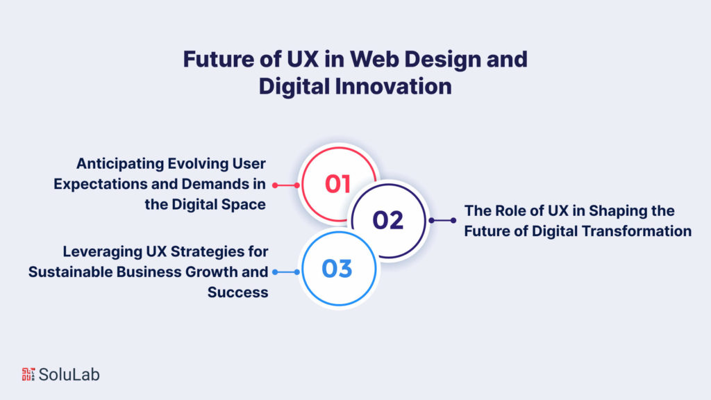
Expectations Keep Moving
The future of UX in web design comes down to reading where users are heading before they arrive. Mobile usage kept climbing past the point anyone had planned for. Voice interfaces showed up loudly and then settled into a narrower set of uses than the hype suggested. Something else will follow that same arc. Designers who watch behaviour rather than press releases tend to stay useful through all of it.
UX Inside Digital Transformation
Digital transformation programmes live or die on whether anyone will use what gets built. User-centered design principles, paired with a genuine read on what users need, is what keeps those programmes from producing expensive internal tools that nobody opens twice. That holds across industries. It is also why UX keeps drifting closer to the strategy conversation and further from the decoration one.
UX As A Growth Lever, Not A Coat Of Paint
All of it points at one outcome: a business that keeps the customers it already paid to acquire. A good experience brings people back, and people coming back is worth more than any single campaign. Put UX in web design near the top of the list and the compounding starts. Less churn. More recommendations. Growth you are not renting month by month.

Conclusion
So where does that leave you? UX in web design is not a visual layer applied near the end of the project. It is a decision about whose problem the site solves and how much effort you are willing to ask for in return. The importance of user experience in web design shows up in plain numbers: who stays, who finishes, who comes back next month. Navigation, responsive layouts, research, information architecture, all of it sits downstream of that single question.
UX design and development services earn their fee well past the point where the mockups look nice. The eCommerce work, the SEO integration, the testing loop: those are the parts that decide whether a design survives contact with real traffic. And the SEO overlap is the least appreciated piece of the whole thing. Page load speed, mobile responsiveness, a layout people can actually operate. Those are not boxes you tick for a crawler. They are what a visitor feels immediately, and the crawler is simply reading the same room.
The newer material is worth watching. Personalisation driven by AI and machine learning has already changed what people expect a site to know about them. AR and VR are still finding their footing, though virtual try-on and immersive storytelling are real uses rather than conference slides. Meanwhile the unglamorous practices carry most of the weight: A/B testing, behaviour analysis, and agile cycles that let UX design and development respond to feedback instead of guessing once and shipping. Keeping an eye on shifting expectations is part of the ordinary job, not a quarterly offsite exercise.
Solulab works in this space, building top-notch web development services for clients who take the importance of user experience in web design seriously instead of treating it as a line item near the bottom of the budget. The approach is client-first, and the work tends to be hands-on rather than advisory. Which brings it back to the honest version: user experience in web design decides whether the thing you built gets used at all. Pick one page. Watch five people try to complete the main action on it without your help. You will have your next quarter of UX work sketched out inside an hour, and probably a few uncomfortable notes to go with it.
FAQs
Bhavya is driving growth through data-backed demand generation for AI and Web3 solutions. With 9+ years in digital marketing, he has spearheaded initiatives that led to a 40% increase in qualified inbound leads. Bhavya shares insights on marketing ROI and scaling a digital presence via AI workflows. He is open to connecting with startups and enterprise teams to help them overcome their challenges.